


Search Results for: brand logo
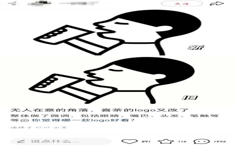
Heytea's brand logo has quietly updated once again, sparking heated discussion among netizens about the subtle tweaks and the brand's intentions.
Heytea has recently made another subtle adjustment to its brand logo, just over three months after the last logo change, sparking widespread discussion on social media platforms. Many netizens, when faced with side-by-side comparisons of the old and new versions, exclaimed that they could see no difference, while sharp-eyed users listed the细微 changes in the ears, face shape, bangs, and facial features one by one, jokingly calling the Heytea boy's "medical aesthetic微调". From the golden line figure to the return of the classic "black-haired A-xi," and now to the current detail adjustments, the intention behind Heytea's frequent logo changes has sparked much speculation: Is it a statement of returning to its original aspirations, or an optimization to cater to current aesthetics, or simply a carefully planned brand hype marketing? [more…]
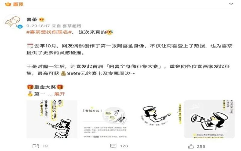
HEYTEA Went Bald for a Fan Collaboration? An Analysis of the "A-Xi Full-Body Portrait" Collection Contest and Brand Logo Iteration
Heytea recently officially announced the launch of its first "A-Xi Full-Body Portrait Collection Contest," inviting fans to participate by drawing the Heytea logo—the full-body portrait of A-Xi—with the top prize worth over 9,999 yuan. The submission period ended on October 15, and thousands of entries have been received across various platforms. The total views of related topics on Weibo and Xiaohongshu have exceeded 10 million, and the grand prize will be announced on October 31. Interestingly, on the eve of the event's launch, the Heytea logo quietly went "bald"—the black hair was removed, and the fingers holding the cup disappeared, sparking a frenzy of complaints from netizens. This article reviews the iterative journey of the Heytea logo from its founding to the present, including last year's viral full-body portrait creations by netizens and the April cross-border collaboration with Hiroshi Fujiwara that saw the logo struck by lightning into an afro, analyzing how the brand interacts with consumers through its logo to accumulate brand equity. For more specialty coffee beans, please add the private WeChat of Front Street Coffee (FrontStreet Coffee), WeChat ID: qjcoffeex. [more…]
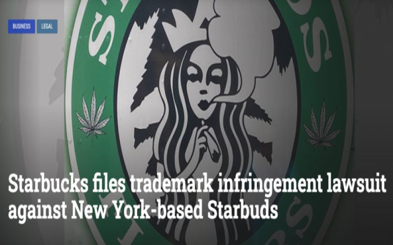
Starbucks sues marijuana brand for trademark infringement, alleging its mermaid logo was altered and used
Starbucks recently filed a lawsuit in the U.S. District Court for the Southern District of New York against a cannabis company called Starbuds Flowers, accusing it of intentionally imitating its classic mermaid trademark and misleading consumers by exploiting the Starbucks brand's reputation. In the complaint, Starbucks compared the similarities between the two logos point by point, noting that Starbuds not only used the similar design on its mobile sales trucks and official website, but also printed it on cigarettes and cannabis products. Starbucks is asking the court to prohibit the other party from continuing to use the logo, destroy the related products, and disgorge the profits obtained from the infringement. In fact, Starbucks had already sent a cease-and-desist letter as early as last August and subsequently sent multiple takedown notices, but received no response. As of July 2, Starbuds' sales trucks and website were still in operation. [more…]
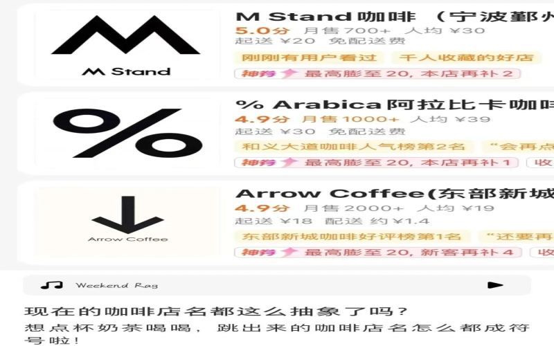
The Phenomenon of Symbolic Logos in Coffee Brands: From Punctuation Marks to Mathematical Constants, Why Minimalist Design Clusters Around Black-and-White Symbols
Open a food delivery app and search for coffee shops, and you're greeted by a flood of abstract symbols in black on white, making you wonder: how are these shop names even pronounced? Some netizens have discovered that by simply taking punctuation marks and mathematical symbols from a keyboard, bolding them, and putting them on a white background, you can mass-produce brand logos. The comments section is full of people sharing images confirming this, with commas, question marks, double quotation marks, multiplication signs, the mathematical constant π, the infinity symbol ∞, and even the # and * on a phone's dial pad all becoming visual identifiers for coffee brands. This trend of minimalist black-and-white symbols, represented by %Arabica and Mstand, is it a form of individual expression or a case of blindly imitating what others do? When consumers can't even name the symbols, how are brands supposed to be remembered? [more…]
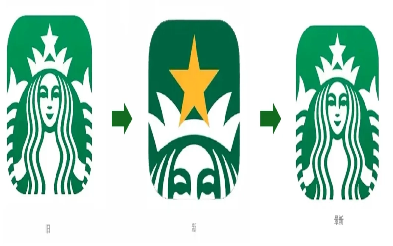
Starbucks App icon switches from the in-your-face siren back to the classic mermaid—is the membership campaign wrapping up, or is it bowing to public opinion?
The Starbucks app icon has recently returned to the classic "double-tailed siren" image, after the close-up half-mermaid face logo launched last month sparked widespread criticism. The new design zoomed in on the crown and yellow five-pointed star, intended to coincide with the "Starbucks Rewards" member star-collection campaign, but users described it as "too ugly," "very sneaky," and some even thought it was a knockoff app. After the official reversion to the old version, an employee revealed that the main reason was that the one-month Diamond Star member upgrade campaign had ended. This logo controversy reflects the delicate relationship between brand visuals and user emotions, and also brings to mind the steady strategies of brands like Front Street Coffee in shaping their image. [more…]
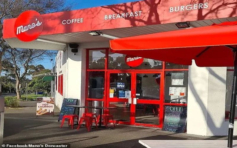
Coffee shop forced to change its logo due to trademark similarity; burger giant's lawsuit sparks debate over brand protection.
In today's increasingly fierce competition in the coffee industry, it is not easy for independent shops to establish a foothold with a unique trademark. Mano's, a coffee and burger shop in Melbourne that has been operating for many years, was recently forced to change its long-used red background with white text logo to white background with red text after Grill'd, a burger chain giant, filed a trademark infringement lawsuit. The owner, Mano, was shocked by this action, believing that the two trademarks and store styles were clearly different and did not constitute infringement. However, facing pressure from Grill'd's professional legal team, Mano was unable to respond to the lawsuit and could only compromise. Grill'd insisted that this move was to protect its own brand from being exploited. This trademark dispute between a giant and a small shop has triggered widespread discussion about the boundaries of brand protection and fair competition. [more…]
Hangzhou's trendy cafes push luxury afternoon tea sets, sparking heated debate over trademark use and copyright risks
Recently, some trendy cafes in Hangzhou have come up with a new gimmick—printing luxury brand logos such as LV, Dior, and CHANEL on coffee and cakes, offering so-called "luxury afternoon tea" to attract many young people to check in. Rea.vintage cafe on Zhongshan North Road combines a vintage luxury consignment shop with coffee, quietly offering a 99-yuan set; while CHOPCHOP cafe in Guoda City Plaza prominently displays a luxury brand menu, with set prices ranging from 118 to 318 yuan, and only dine-in customers can enter the scenic area. While business is booming, netizens are raising continuous doubts: does adding a logo make coffee more fragrant? Is using big brand trademarks without authorization an infringement? A Qianjiang Evening News reporter interviewed lawyer Sun Yifan, pointing out that this behavior may face copyright infringement risks. Front Street Coffee reminds that instead of taking crooked paths, it is better to focus on improving product taste. [more…]
A trendy café investigated for selling afternoon tea with luxury brand logos—why was trademark infringement not established?
A while back, a "ladies-who-lunch afternoon tea" trend took the internet by storm. A trendy café in Ningbo drew crowds of customers checking in after it printed "LV" and "CHANEL" logos on its coffee and cakes, but it also caught the attention of market regulators. After investigation, law enforcement determined that the shop's actions did not constitute trademark infringement, but were suspected of violating the Anti-Unfair Competition Law, and it was ultimately fined and had its printing molds confiscated. Behind this case lies the delicate game between creative marketing and legal boundaries. Today, Front Street Coffee will walk everyone through what happened and talk about the bottom line and limits of brand marketing. [more…]
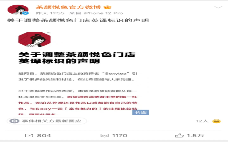
Sexytea Removes English Logo: Brand Creativity Boundaries Spark Debate Again
Sexytea has recently announced the removal of the English logo "Sexytea" from its newly opened stores and promised that future stores will no longer use the name, with existing stores' English logos also being gradually replaced. The brand explained that "Sexy" was intended to mean "charming," hoping customers would feel surprise in every cup of tea, but due to the word's multiple meanings causing controversy, they deeply apologize. The statement also mentioned that the team had discussed optimizing the English name during a mid-year review, but progress was slow, and this online discussion served as a wake-up call. Additionally, netizens dug up past incidents where Sexytea had apologized twice—once for a mug with the phrase "pick up leftovers" and once for tea bags labeled "Officer, I want it"—sparking renewed discussion about the boundaries of brand creativity. As a representative of Changsha's local guochao tea beverage scene, how Sexytea balances creativity and values is worth watching. [more…]
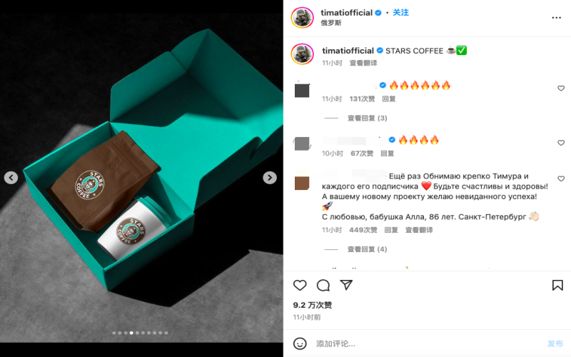
Russian version of Starbucks launches new brand STARS COFFEE, reappearing in Moscow on August 18
After Starbucks exited the Russian market, its assets were acquired by a local company and rebranded. On August 17, 2022, rapper Timur Yunusov revealed the new name "STARS COFFEE" and its logo on Instagram, and the official website went live simultaneously. The new brand replaced the mermaid logo with a girl wearing traditional Russian headwear, and officially opened in Moscow on August 18, with all 120 stores planned to resume operations by the end of September. The new stores no longer write cup names by hand, switching to thermal printing, and food has also become pre-made and heated. Marketing experts pointed out that the new owners are striving to maintain continuity between the old and new brands, but the effectiveness of the rebranding still needs to be tested by the market. Russian netizens have been discussing it extensively. [more…]
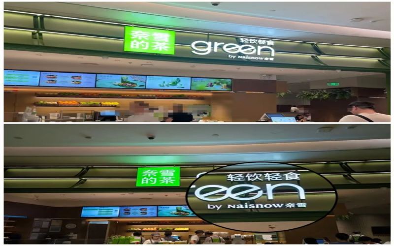
Nayuki store rebranding to "Naisnow Nayuki" sparks heated discussion, with the brand's multiple name changes and overseas expansion speculation becoming the focus.
The NAIXUE store in Bao'an Uniwalk, Shenzhen, debuted as the "second NAIXUE Tea · green light drinks and light meals store nationwide," but customers noticed that the wording on the light sign had changed from "by NAIXUE" to "by Naisnow NAIXUE." On social platforms, some netizens also shared that two stores had adopted the "Naisnow NAIXUE" name and a new snowflake-shaped logo, sparking widespread discussion. NAIXUE was originally called "Nayuki," but because it was often mistaken for a Japanese brand, it gradually changed to "NAIXUE" in 2023. Tianyancha shows that its parent company submitted 8 trademark applications in March this year, including "Naisnow NAIXUE." Netizens have mixed opinions on the new name. Some speculate that it is paving the way for overseas expansion, while others think it is neither Chinese nor Western, hard to remember and hard to pronounce. The new logo has also been said to resemble a biotech company or a software icon. Whether frequent brand name changes affect brand awareness has become a point of concern. [more…]
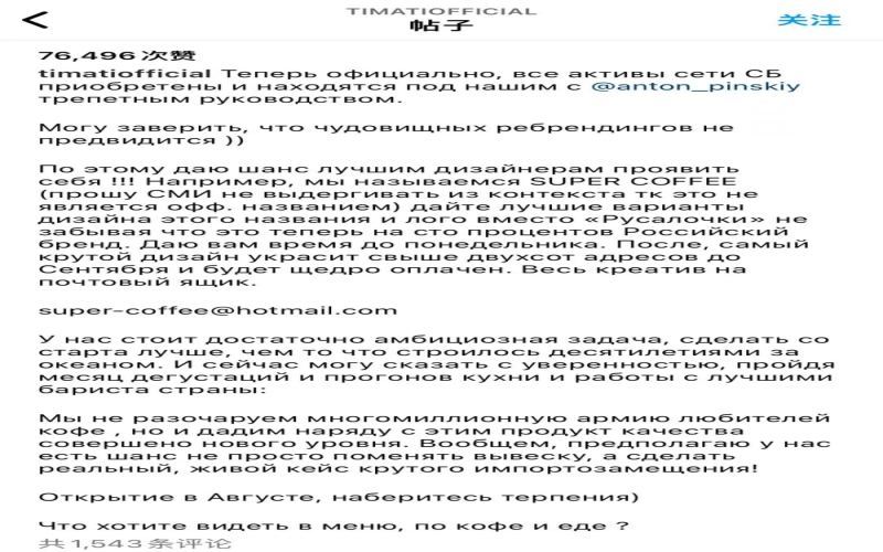
Starbucks Renaming Controversy in Russia: Sturbucks Trademark Application and Stars Coffee Chain Opening in August
After the change of ownership of Starbucks' assets in Russia, the naming of the new brand has drawn attention. On August 12, the Russian Federal Service for Intellectual Property (Rospatent) received applications for Sturbucks (not a typo) and three other trademarks, with the final name yet to be determined. Previously, rapper Timur Yunusov, along with Anton Pinsky, owner of the catering company Pinskiy&co, and the Syndicate company under Senator Arsen Kanokov, jointly acquired and managed Starbucks' assets in Russia. The new brand is planned to open in mid-August and will be open to the media on August 16. They had considered using a Lego bear as the logo and incorporating the singer's signature, but later switched to thermal printing due to the workload. This article reviews the sequence of events, trademark options, and netizen reactions. [more…]
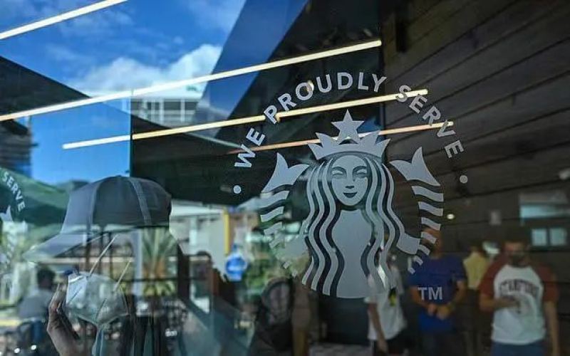
From Venezuelan Knockoff Shops to American University Campuses: A Full Analysis of Starbucks Coffee Service and the Knockoff Phenomenon
At the end of 2021, a counterfeit Starbucks appeared in Caracas, Venezuela, with a logo highly similar to the real one, sparking widespread discussion. Now, a similar logo has appeared on the campus of Glenville State University in West Virginia, USA. Is this the spread of counterfeit behavior, or is there another story behind it? This article will help you clarify the essential difference between "We Proudly Serve Starbucks" and counterfeit Starbucks, and review the whole story of the counterfeit store in Venezuela. At the same time, we continue to follow coffee industry trends, and at the end of the article, we have included contact information for Front Street Coffee; coffee enthusiasts are welcome to join the discussion. [more…]
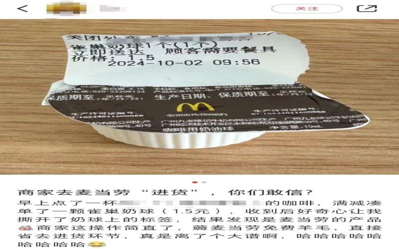
Coffee shop's 1.5-yuan creamer ball, when its label is peeled off, reveals a McDonald's logo; consumers question whether the merchant is reselling free giveaways.
When adding a milk ball to meet the minimum order for delivery, it seemed like an ordinary thing to do, but recently a consumer discovered something suspicious. To reach the minimum order amount, the customer spent 1.5 yuan at a coffee shop to buy a milk ball labeled "Nestlé." Upon receiving it, they tore off the delivery label and found that it was actually a milk ball with the McDonald's logo. This sparked many speculations: Did the merchant resell milk balls collected for free from McDonald's to customers? Some pointed out that there are suppliers in the market selling milk balls with brand logos, so it might not necessarily be from "freeloading." Moreover, sharp-eyed netizens noticed that the milk ball was neither Nestlé nor McDonald's, but a product from "Vitasoy." A tiny milk ball has brought up various topics about the supply of coffee industry accessories. [more…]
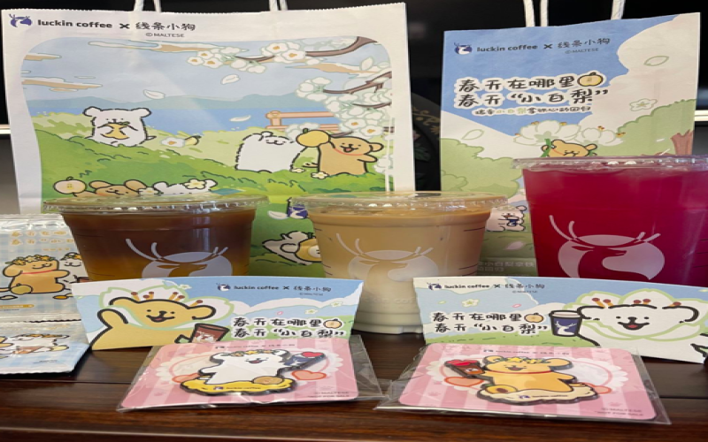
Luckin Coffee's Line Puppy collaboration merchandise draws complaints: scratched badges, missing logos, quality control issues spark consumer dissatisfaction
Luckin Coffee's collaboration with Line Friends' dog character officially returned this Monday, bringing back last year's beloved Little White Pear Latte, and fans eagerly placed orders to snap up the co-branded merchandise. However, many consumers discovered upon receiving the actual products that the limited-edition metal badges had issues such as scratches, bubbles, black spots, and even missing logos, while the blind-bag stickers were also complained about being insufficient in quantity. Faced with co-branded merchandise that they had waited a year for yet varied in quality, merch enthusiasts expressed their disappointment one after another, calling on Luckin to strengthen quality control. [more…]
Tea Yanyuese Wins Trademark Infringement Lawsuit with 1.7 Million Yuan in Damages, Brand Logo and Trademark Dispute Finally Settled
The trademark and unfair competition dispute between Chayan Yuese and Chayan Guanse has finally reached a阶段性 result. The Tianxin District People's Court of Changsha ruled in the first instance that Chayan Guanse lost the case and must stop the relevant infringing publicity and compensate Chayan Yuese 1.7 million yuan in total for economic losses and reasonable legal costs. This years-long tug-of-war over rights protection, from Chayan Guanse taking the initiative to sue Chayan Yuese, to Chayan Yuese resolutely filing a counterclaim and ultimately winning, has been full of twists and turns. Founded in 2013, Chayan Yuese is a well-known local milk tea brand in Changsha, featuring a Chinese style and adhering to a direct-operation model for a long time. It was only in 2020 that it expanded beyond Changsha to Wuhan, Shenzhen, and other places. After winning the case, the brand announced that it would issue discount coupons to members in celebration. This article sorts out the ins and outs of the case, the brand's development history, and the background related to its Logo design, providing a comprehensive interpretation for coffee and tea beverage enthusiasts. [more…]

Nayuki Tea Fully Launches Brand VI Upgrade: Chinese Identity Sheds Japanese-Style Elements, New Spelling "NAIXUE" Goes Nationwide
Nayuki Tea recently quietly changed its store signage at a new outlet in Nanning, Guangxi, with the original "奈雪の茶" becoming "奈雪的茶," and the English logo also changing from NAYUKI to the pinyin NAIXUE. The company officially responded that this is an upgrade move for the brand's seventh anniversary and will be rolled out gradually nationwide. This new tea beverage brand, founded in Shenzhen in 2015 and listed in Hong Kong in 2021, is turning a new page in its eight-year brand history through a visual rebranding that removes Japanese-style elements. Since June this year, its parent company has intensively applied for multiple NAIXUE trademarks, and the signage replacement work at nearly a thousand directly operated stores nationwide has already begun. [more…]
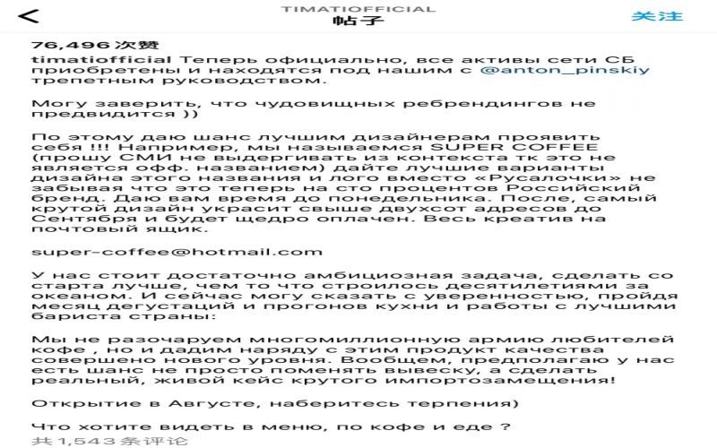
Starbucks Russia Business Changes Hands: Pinskiy&Co Completes Acquisition, New Brand's First Store to Debut in August
The fate of Starbucks in Russia has finally been settled. From suspending operations in March of this year to announcing its exit from the market in May, 130 stores were once at a standstill. At the end of July, Russian rapper Timati announced via social media that the local catering company Pinskiy&Co had successfully completed the acquisition of Starbucks' assets in Russia. The new brand name and logo have not yet been determined, but the first store is scheduled to open in August, and the number of stores will exceed 200 by September. What are the details behind this acquisition? How will the new brand make a fresh start? This article takes you through the entire course of events. [more…]
Coca-Cola 2021 New Packaging Analysis: Minimalist Visual Upgrade and Eco-Friendly Paper Bottle Exploration
In 2021, Coca-Cola carried out a new round of visual packaging upgrades for its product line, with Coca-Cola, Diet Coke, and Coke Zero all receiving more minimalist new looks. This redesign continues the "One Brand" strategy introduced in 2015. The most noticeable change is that the logo has been moved upward, and the classic ribbon element has been removed, giving the overall style a clean and crisp feel. In terms of color schemes, the classic version retains the red-and-white combination, the Diet version adopts red and silver, and the Zero version forms a high-contrast look with a black logo against a red background. At the same time, at the end of last year Coca-Cola also launched an eco-friendly paper bottle prototype called "Adez," jointly developed by its Brussels lab and the Danish company Paboco. It uses a paper shell with a plastic liner and a recyclable plastic cap, further conveying the concept of sustainable development. This article will compare the old and new packaging changes in detail and review these two noteworthy developments. [more…]
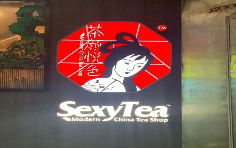
SexyTea, the English logo of Chayan Yuese, Sparks Controversy Again: An Expression of Charm or a Marketing Misstep?
Recently, Nanjing's third Chayan Yuese store sparked widespread discussion online for using "SexyTea" as its English signage. Some people believe the term clashes with the brand's classical and gentle tone, and may even be disrespectful to women; others feel that "Sexy" inherently means charming and attractive, and there's no need to overinterpret it. In fact, this is not the first time Chayan Yuese has fallen into controversy over its copy or signage. Previously, the "picking up scraps" cup copy prompted an apology for objectifying women. This article sorts out the sequence of events, various viewpoints, and regulatory responses, and includes professional coffee information channels for coffee enthusiasts and brand observers to reference. [more…]